

Very Peri Pantone 2022: decorating your home with the color of the year
Post from EditorialsFrom armchairs for the relaxation area and textile elements for the bedroom to all kinds of accessories: here's how to insert the Pantone's color of the year inside your home.
Very Peri, the Pantone color for 2022
Close your eyes and imagine a sunset over the sea. A red and hypnotic ball that, minute by minute, goes down until it disappears into the blue of the water, coloring it with reddish brushstrokes that gradually become one: the blue, the red and the purple that comes out of the their symbolic and eternal embrace.
Now open your eyes and realize that, thanks to Very Peri, the Pantone color 2022, you will be able to bring this same awesomeness inside your home.


We also find that an amazing sense of security and tranquility is transmitted by a periwinkle blue base, which refers to the flower of the same name. Also, another wonderful feature is the creative boost given by a red-violet undertone: these are the distinctive characteristics of the shade that will come to your house in the coming months.
After the Ultimate Grey e Illuminating, the protagonist of 2021, the experts of the Pantone Color Institute have created a brand new nuance for 2022 and this is actually the very first time this has happened in the history of the US company.
As a matter of fact this choice is actually the answer to the need to represent the transition period we are experiencing, in which the boundaries between physical and digital spaces are less and less marked, just like the domestic ones.
How to pair the Pantone's Color of the Year 2022
A home that is tinged with Very Peri is certantly characterized by uniqueness and fluidity.
But the question is: how to use the Pantone color of 2022 indoors?
Experts from the Pantone Color Institute suggest four palettes to combine it with.
The Star of the show is ideal for those who want to rely on the timeless elegance of neutral tones. This palette includes the dove gray color that can be mixed with light sand or ice, the anthracite and, of course, the Very Peri, which is essential to give this combination strenght and elegance.
Balancing act is a perfect balance between warm and cold shades: the protagonists are different shades of pink which, together with Very Peri, give life to a vibrant and luminous combination.
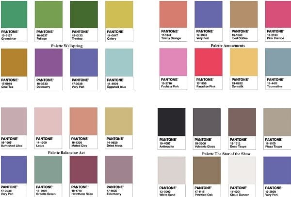
Interior design lights up with Amusements, palettes with bold shades, designed for those who are not afraid to dare. Vitamin pink, mustard color, tourmaline combine with Very Peri for an effect that will not go unnoticed.
Do you also want to create a visual continuum between indoor and outdoor?
Bet on Wellspring, a selection of shades inspired by nature.
Various veins of green, lilac and blue join the Very Peri. The result?
A chromatic and trendy harmony that can be proposed in every room of the house.
How to use Very Peri for your house entrance
Its ability to convey relaxation and, at the same time, pure strenght makes Very Peri an ideal shade both for painting large surfaces and for being applied on a functional complement. But that's not all: just a hint, intriguing and decisive, on an accessory or a print is able to actually give life to environments with a strong personality and energy.
How to use it in the entrance of your house? The answer is: in this particular space it can actually express itself in all its chromatic power.
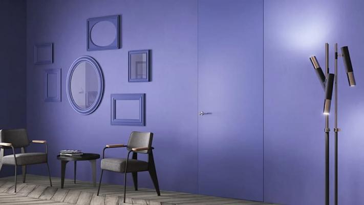
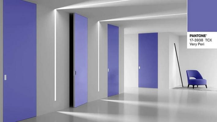
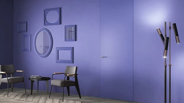
How? If the condominium rules allow it, you can paint the entrance door in Very Peri. That of the colored doors is a typical feature of English houses, which begins to take hold in our part as well.
Another great idea, for those who want it, is to be recreated indoors. FerreroLegno, for example, offers some models of its Pantone 2022 color range.
Sistema Zero definitely stands out among the proposals: we are talking about a line of flush-to-the-wall doors in which the door gains a new identity: it does not disappear, but becomes a piece of furniture with character, even more so if you choose Very Peri as its color.
Ermetika presents elegant and versatile flush-to-the-wall doors in the same shade: they are incredibly striking on their own but they can also be camouflaged with a wall for bold projects.

The relaxation area colored with Very Peri
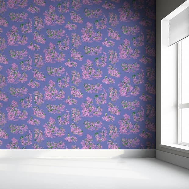
While on the subject, how about making the wall behind the sofa the real protagonist?
You can do this by painting it with the Pantone color of 2022 or by inserting a wallpaper with the exact same color.
An example? Once Upon Our Time by Mineheart takes up the classic patterns of fabrics and textile elements of the past, reinterpreting them in a highly modern key.
Beautiful to see and apply: it is printed on a smooth and resistant paper and, therefore, it is very easy to spread and remove.
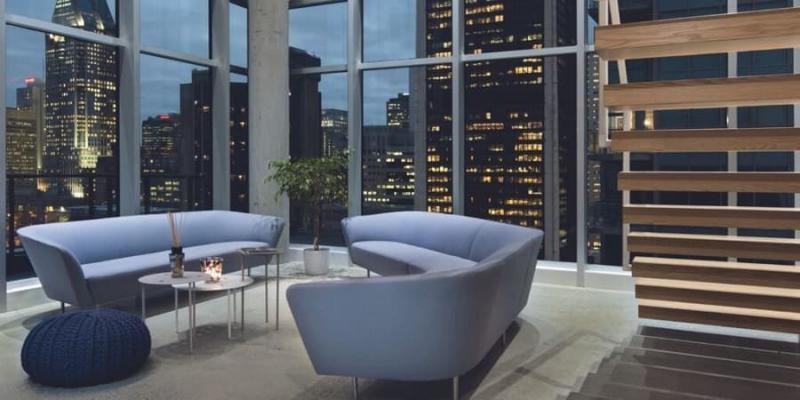
How about renovating the relaxation area with a Very Peri sofa?
Arper has decided to use the Pantone color of 2022 to revitalize and update Loop: an amazing modular sofa system that, thanks to its versatility, can be used to furnish a large open space or to recreate an intimate and compact corner.
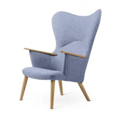
Which is the best way to spend your winter break moments?
I would say: with a book, a plaid and a comfortable armchair like the CH78 Lounge Chair by Carl Hansen & Søn.
Affectionately renamed the mother bear of chairs, with its soft and enveloping shapes, it will make you feel safe like a maternal embrace.

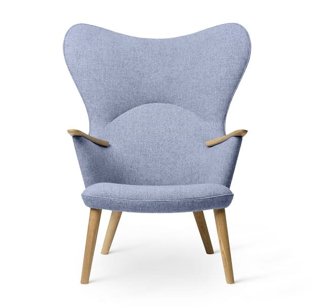 Affectionately renamed the mother bear of chairs, with its soft and enveloping shapes, it will make you feel safe like a maternal embrace.
The kitchen lights up with Very Peri
The kitchen represents, in some way, the mother of all the rooms in the house: it is here, in fact, that the idea of nourishment is best expressed through the food we prepare, consume and share together with our dearest loved ones.
We enjoy food with our eyes, even before eating it: this is the spirit that animates Fantin's frame monobloc kitchens.
These kitchens are made with two or three modules, with a resistant top in Barazza steel or Fenix NTM. They are available in the complete version with sink, faucet or empty, with the possibility of use as a storage unit, to have tools and small appliances in order and within reach.
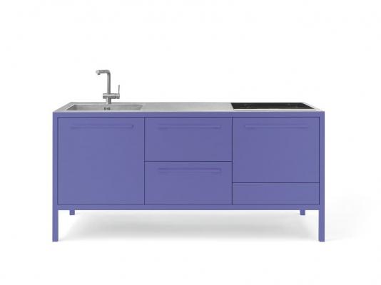
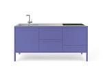
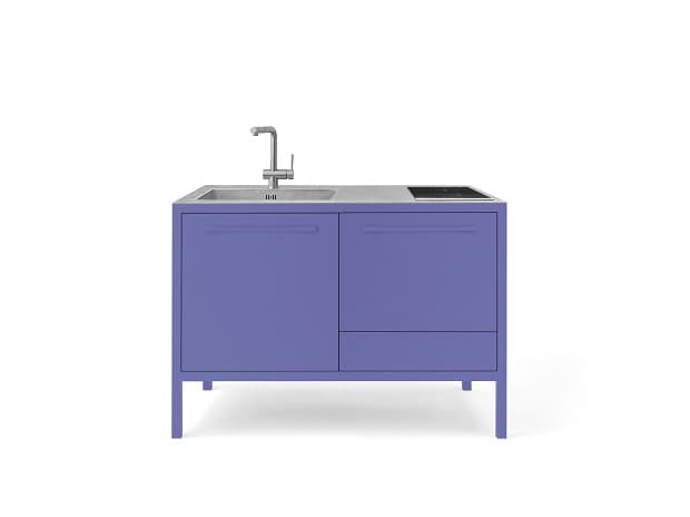
On the other hand, if you want to add a simple touch of Very Peri color, Steel's semi-professional kitchens are the best solution for you.
Among the proposals available, the Amethyst finish is in line with Pantone's indications for 2022.
Do you want to be super trendy? Choose the same shade for the backsplash tiles or to paint a part of the wall, as in the photo above.
The most amazing look is guaranteed!
 On the other hand, if you want to add a simple touch of Very Peri color,
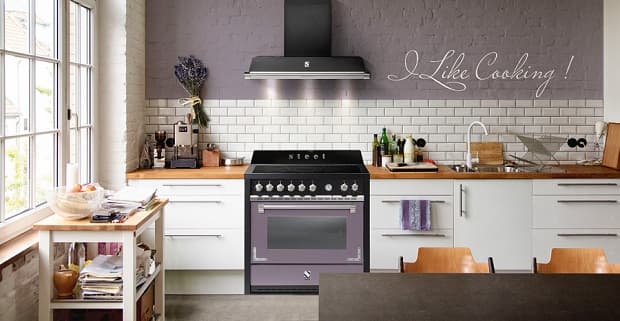
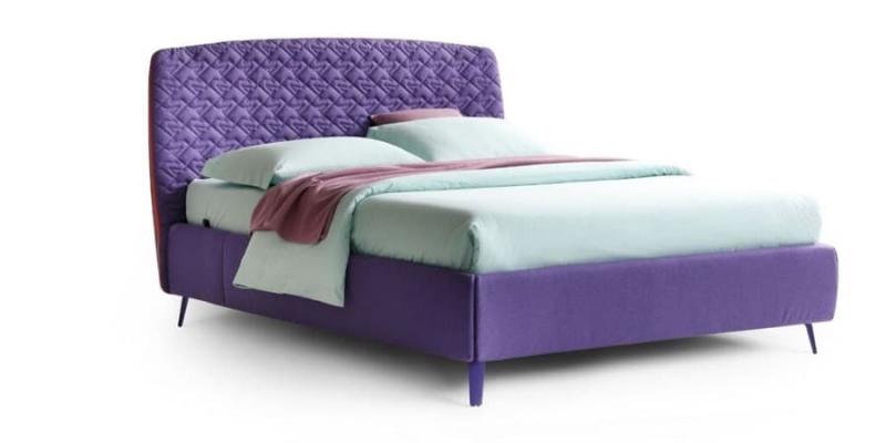
Relax Very Peri in the bedroom
However, it is in the bedroom that Very Peri and, in particular its blue soul, a color linked to the idea of calm and relaxation, finds its maximum expression and application.
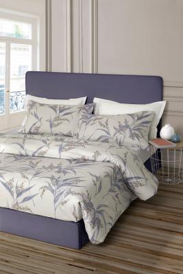
A solution that will not go unnoticed is the Cama bed by Noctis.
A slightly rounded and clearly vintage-inspired headboard, which is removable thanks to a practical zip that divides the front and back, visible only on the side for an effect of visual continuity with the upholstery or choice, in agreement or contrast, with the tones of the room.
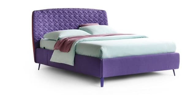
You can, therefore, focus on a Very Peri monochromatic alternative or combine the Pantone color 2022 with one of the shades proposed by the same US company; as you prefer!
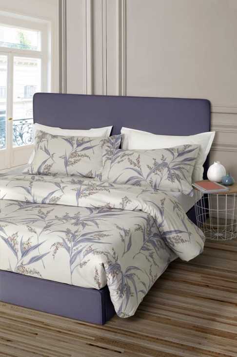
Do you want a textile set that further enhances it?
Winter is sweeter with Berry, the quilt from the Origami Print Winter Edition collection by Somma 1867 (Gabel group): refined and precious features for a complete bed that combines oriental charm with that of classic furniture.
Next, the series of contemporary rugs by GT Design is precisely what you need to rely on if you are looking for warm and comfortable steps.
Performing and versatile, they are simply perfect underneath the foot of the bed, a reading chair or the beauty corner.
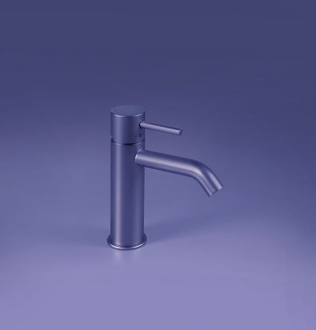
The bathroom: a Very Peri's oasis of peace
In line with the sense of fluidity inherent in the choice of Pantone color 2022, the bathroom, from a space dedicated to personal care, is transformed into a home spa.
In this case, personalization becomes even more important to give life to a room that speaks of us.
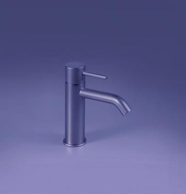
FIR Italia completely understood this and, thanks to a mix of cutting-edge production processes, offers tailor-made aesthetic solutions.
Thanks to the Custom Outfits project it is actually possible to combine four kinds of finishes (matt, semi-matt, glossy and semi-gloss), with infinite shades, including Very Peri, creating designer taps that adapt to different tastes and needs.
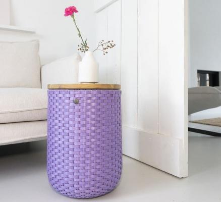
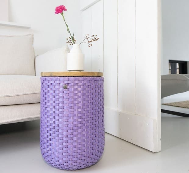
In addition to a nice hot bath, do you want to pamper yourself with some music, a magazine or the essence of a scented candle?
Halo Sit by TakaTomo is a decorative coffee table with storage compartment that, if necessary, can be used as a comfortable stool. Use the acacia wood lid to place on it everything you need to relax.
What are you waiting for? It's time to slip into the bathtub, close your eyes and imagine a wonderful sunset over the sea, as beautiful and unique as the awesomeness that the Very Peri will bring into your home. Are you ready to try it?
80943 REGISTERED USERS


Joined the REA 841143/NA 26/01/11. Capital fully paid 15.77 k.
Publisher writing to R.O.C. Registry Operators of Communication to the number 20714 on 01/31/2011